At STBY we are always on the lookout for new tools to ease or enhance our work. There are always risks that come with experimenting with new gadgets and apps, and so many factors that dictate the extent to which we fully adopt new tech. Our experience with Airtable, a cloud based collaborative spreadsheet/database builder, illustrates this perfectly. We of course aren’t the only researchers experimenting with Airtable to document, organize and analyse data (see some examples here). Inspired by Tomer Sharon’s fruitful writings and reflections on his use of Airtable while at We Work, we have- alongside many other clients and partners- appropriated the platform for our own research purposes. So far, it’s been pretty cool and its advantages from a design research perspective are obvious; it looks and feels like a spreadsheet optimised for qualitative data collection and analysis. There are a few shortcomings however, which have left us questioning whether we will ever fully embrace it as an agency. A few perks, pros and cons of the service specifically relevant to the design research context are outlined below.
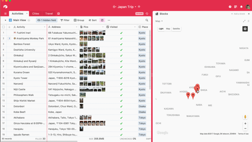
Map your fieldwork site visits with the click of a button
If you have dozens of home or site visits planned in a country or region not familiar to you, the Map Block feature is great. While it is probably possible to do with other spreadsheet services, Airtable makes it so easy and displays the data it in a way that is simple and clear. Recruiters typically give us a list of participants and addresses, but this information is of little use to us in terms of gauging accessibility, travel time, and relative proximity. Mapping participants allows us to quickly see if all of the locations are relatively easy to reach, calculate travel time and transport options, and get a sense of which ones we could cluster and visit on the same day.
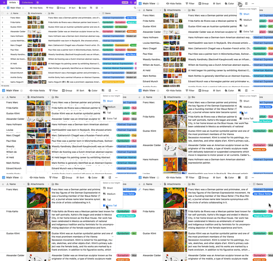
Multiple ways to view your data
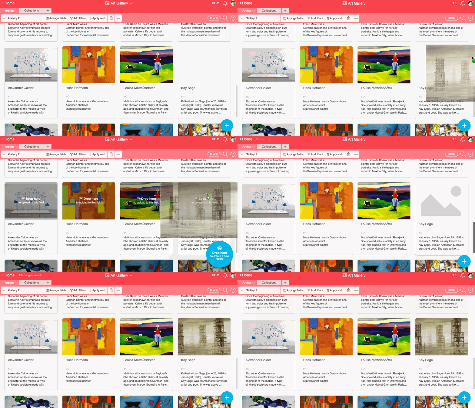
This is where Airtable really shines as a great qualitative research bedfellow. Spreadsheet view is great for some things, like when you have to organise and view lots of data, or tag and sort multiple data snippets. But it’s not so great for sharing and presenting. Sometimes you just want to zoom in on one data snippet, or one participant. The Airtable Gallery view is great for this. We recently conducted a series of home visits with a select few dairy study participants. Just before we set out into the field, we were easily able to introduce the participants to the client team. Rather than sharing a dull, barely legible spreadsheet with a bunch of names and descriptions, or waste time populating an entirely new slide deck, we were able to quickly share a photo-rich series of visually engaging profiles.
Easily link participants with every record of data collected from them
A linked record field lets you create relationships between related records by linking them. This is particularly useful when you have a few tables for related items or concepts—for example, if you have a table of participants and a table of data points (e.g. quotes and fieldnotes), you can use a linked record field to link each data point to the participant who it relates to.
Drag images and documents into cells
Snaps of participants, mobile screenshots, photos and notes from the field, and consent forms can all be dragged and dropped into cells on Airtable. This makes it really easy to keep all documents related to a certain person or place neatly organised, accessible and trackable. You can’t upload video or audio files, which is a limitation. Image attachments work especially well in gallery view.
Translate with the click of a button
We recently conducted a diary study with participants in Mexico, which produced about 500 diary entries in a week, all in Spanish. Our client wanted everything delivered in English, and we did not want to burden our local partner with tedious translation work at the expense of analysis time. Cue the Airtable Translate Block, which uses a Google Cloud Translate API key to translate the contents of any text-based field from one language to another. The translation wasn’t perfect, but it shaved off plenty of time.
Tag, tag, tag away
The multiple selected field makes it easy to start coding data. We simply create a separate column next to our data entries. Depending on the coding approach (e.g. deductive, inductive, hybrid), you can easily select or add to a list of predetermined options from a list to tag the data point accordingly. You can easily select multiple codes.
A few pitfalls and limitations
As described above, there is no way to embed video or audio into cells, as you can do with images and documents. We use video clips and audio a lot in our work, so it’s important to be able to include these. As of now, we have to embed links to video and audio clips that are stored on Google Drive.
Though there are quite a few good integrations with other apps, we’d like to see more sophisticated integrations with research tools like Experience Fellow and Usability Hub. Right now we have to download CSV files and reupload the data to Airtable. This doesn’t seem like too much of a fuss, but when images are involved, things get tricky and very manual.
Finally, the platform feels a bit closed to those who do not use it already. We have a single client who uses Airtable, which makes it easy and straightforward to share data with them in this way. But for clients who don’t use Airtable, using it is often counterproductive. Lack of widespread adoption is a huge barrier for us as an agency, and we therefore sadly tend to fall back on Google Sheets or Excel. Adding to that, it’s quite pricey too.
The bottom line
While we may continue to use Airtable with clients who use it (thus far the minority), I unfortunately don’t think we will use it otherwise. At the moment it is therefore not great value for money for us. I am hopeful this will change though, as more researchers see the enormous potential for Airtable in their everyday work.


